Friday, April 11, 2008

"Level" vs. "L-"

Abbreviations. We've all been guilty of using them. It's a natural human tendency. It is rumored that in 1998, Level 3 had to quickly redesign its first logo because they found-out a company called L-3 Communications had the right to use that fateful abbreviation, leading to the current generally accepted implementation of the full name (rather than an abbreviation). Occasional mistakes when talking to a representative of one company and referencing the other are infamous. In-fact, on June 7, 2006 after Frank Lanza -L3's CEO- passed away, Level 3's stock took a 7% beating -- talk about a bad case of mistaken identity!

The enclosed photo comes courtesy of my brother-in-law Gary who lives in Southern California and had the audacity to take this snapshot on his way home from work.
Saturday, April 5, 2008

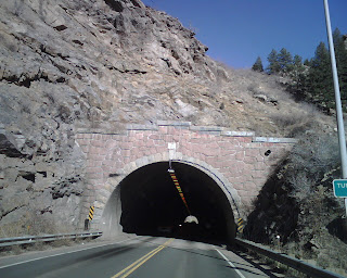
Tunnel 3

Returning from the mountains, I noticed the tunnels were numbered. Obviously, I had to take a picture of "Tunnel 3". As you can see, there is light at the end...

Monday, March 24, 2008

Level.. C?

This afternoon as my son Pablo and I were discussing our brand-new haircuts my eye strayed to a brand-new bar they're building. Now, I was aware of at least two "Level 3" bars (Atlanta and Hollywood), so it seemed reasonable to me the tradition could continue in the Metro Denver area. You can imagine my dismay when I found a letter C where the number 3 should be. Sure, "C" is the third letter in the alphabet... close but no cigar. I suppose in a pinch I could be persuaded to have a drink or two at this establishment, still, the experience won't be everything it could. They need to move-up to the right level.

Wednesday, February 27, 2008

Part Deux -The bear of the east

So, I figure there are a couple of ways you could react to DIA's Terminal East "Level 3" implementation. On one hand, one can be bullish about having two sets of Level 3 signs at the airport, each with a distinct personality. On the other, one can be bearish due to the color scheme used on the East side. Given the fact the blue background on the east side is intended to give travelers visual cues as to whether they are on the correct side of the airport (and Lord knows travelers are already clueless enough as it is), I choose to go with the former attitude. Kudos DIA!

Tuesday, February 26, 2008

LVLT at DIA

Now that's what I call a Level 3 sign! Red, white and black (the desirable color scheme), the correct nomenclature and a spur to boot (sorry, I could not resist that last comment). Denver International Airport, my hat is off to you! -and no, there is no "hat level" at DIA, I checked!

Wednesday, February 13, 2008

The real deal

Such a nice day for a walk. Crisp, clean air. Sunny skies. And the threat of six inches of snow tonight with twenties for a high tomorrow. So I decided to break with the "lunch at my desk" routine and take a leisurely stroll. And there she was, staring me straight in the eyes. The Level 3 sign. It's kind of ironic that I drive by this sign every morning, yet it was conspicuously absent from this blog. No longer. This is what those other signs at parking lots and event centers aspire to be when they grow up. The real deal.

Wednesday, February 6, 2008

Lawyers and Letters

I must admit I was not expecting to make a blog entry today. I do, after all, have a DU picture on the blog already. I was intrigued, however, by the Sturm College of Law's implementation of the name. I don't think I've ever seen a "Level Three" (spelled-out) before. Leave it up to the lawyers and they'll find a way to use more letters (after all, isn't that how they charge for their services - by the number of characters used?)